Applications
Photography & Art Direction
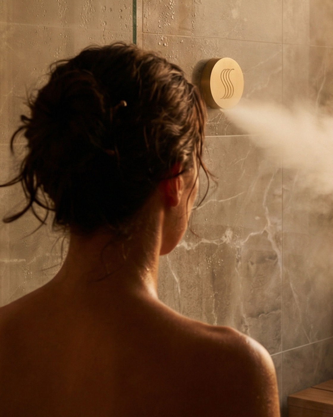
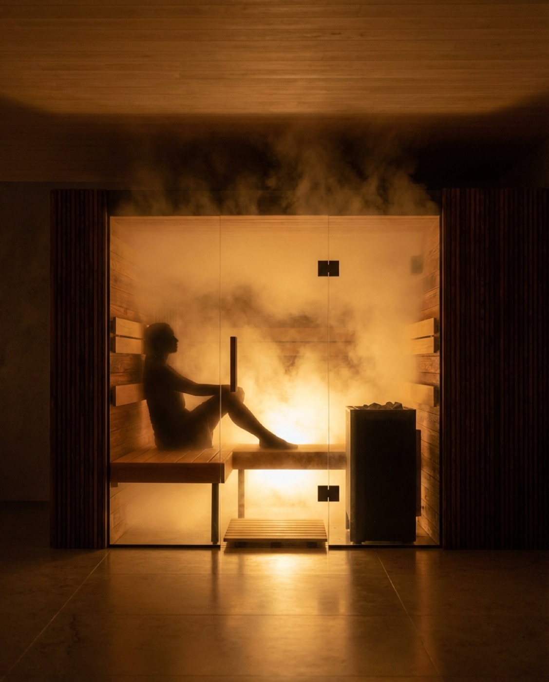
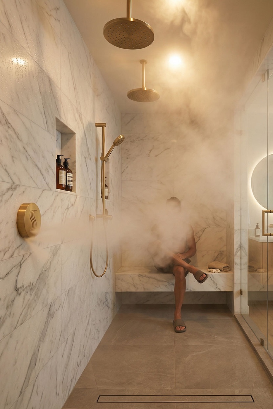
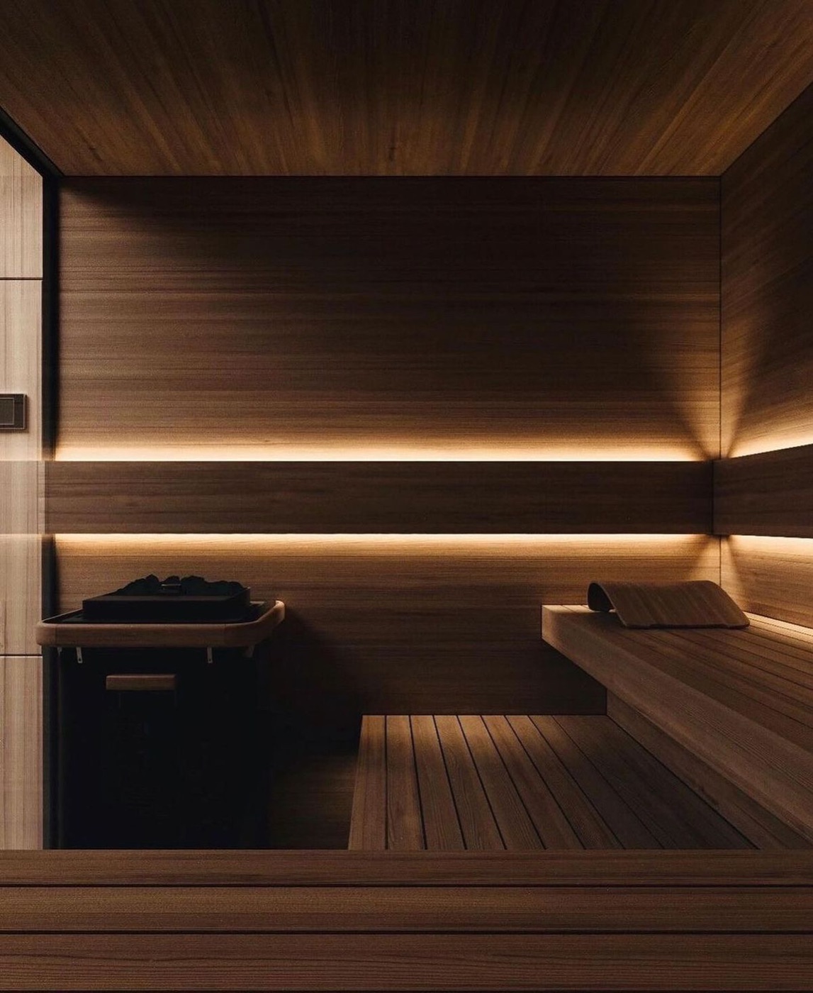
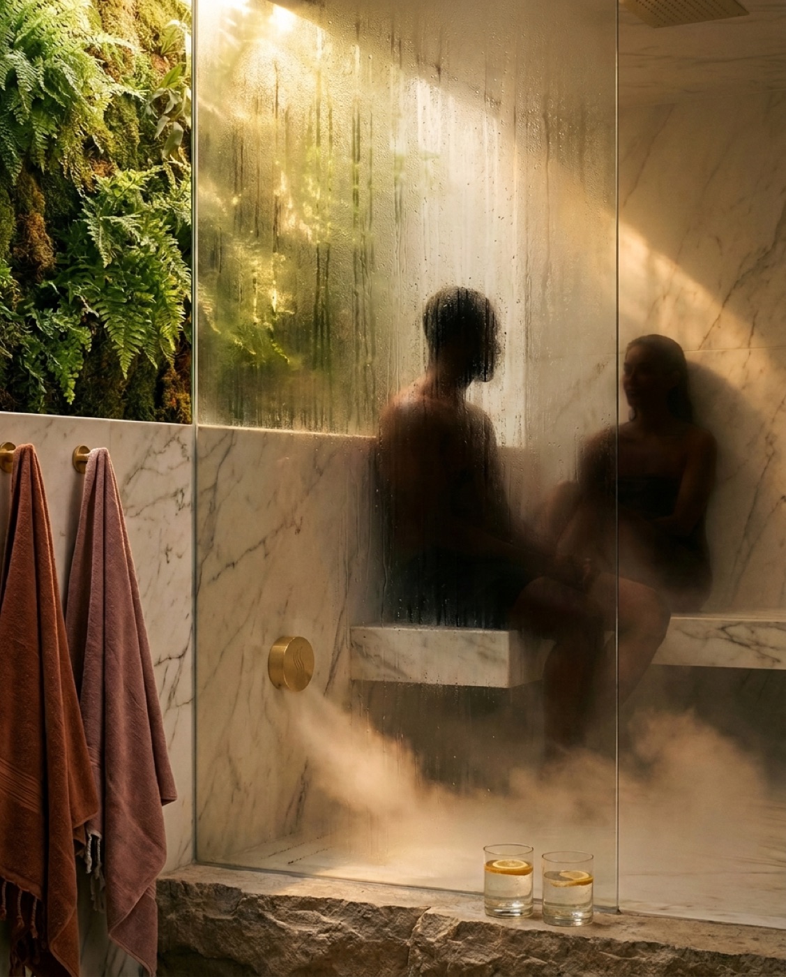
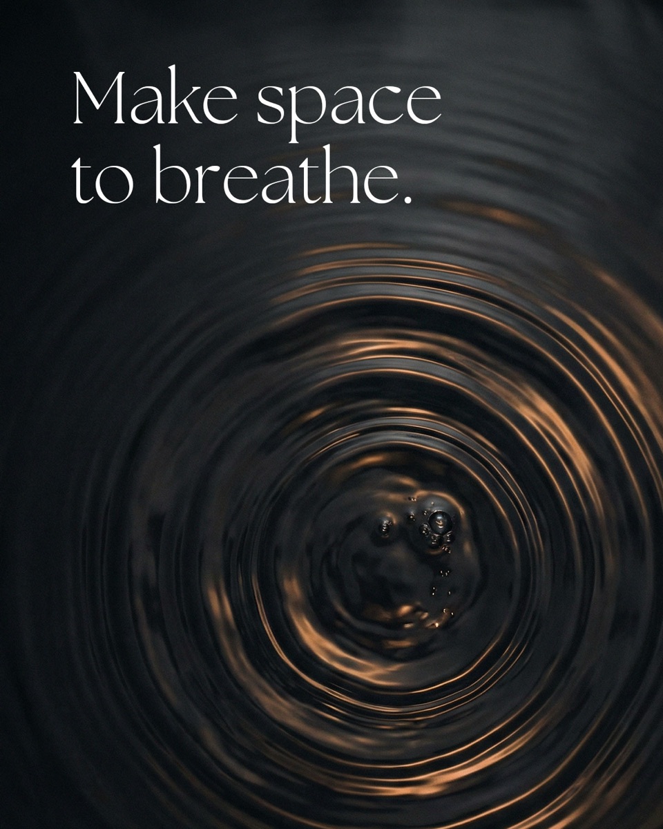
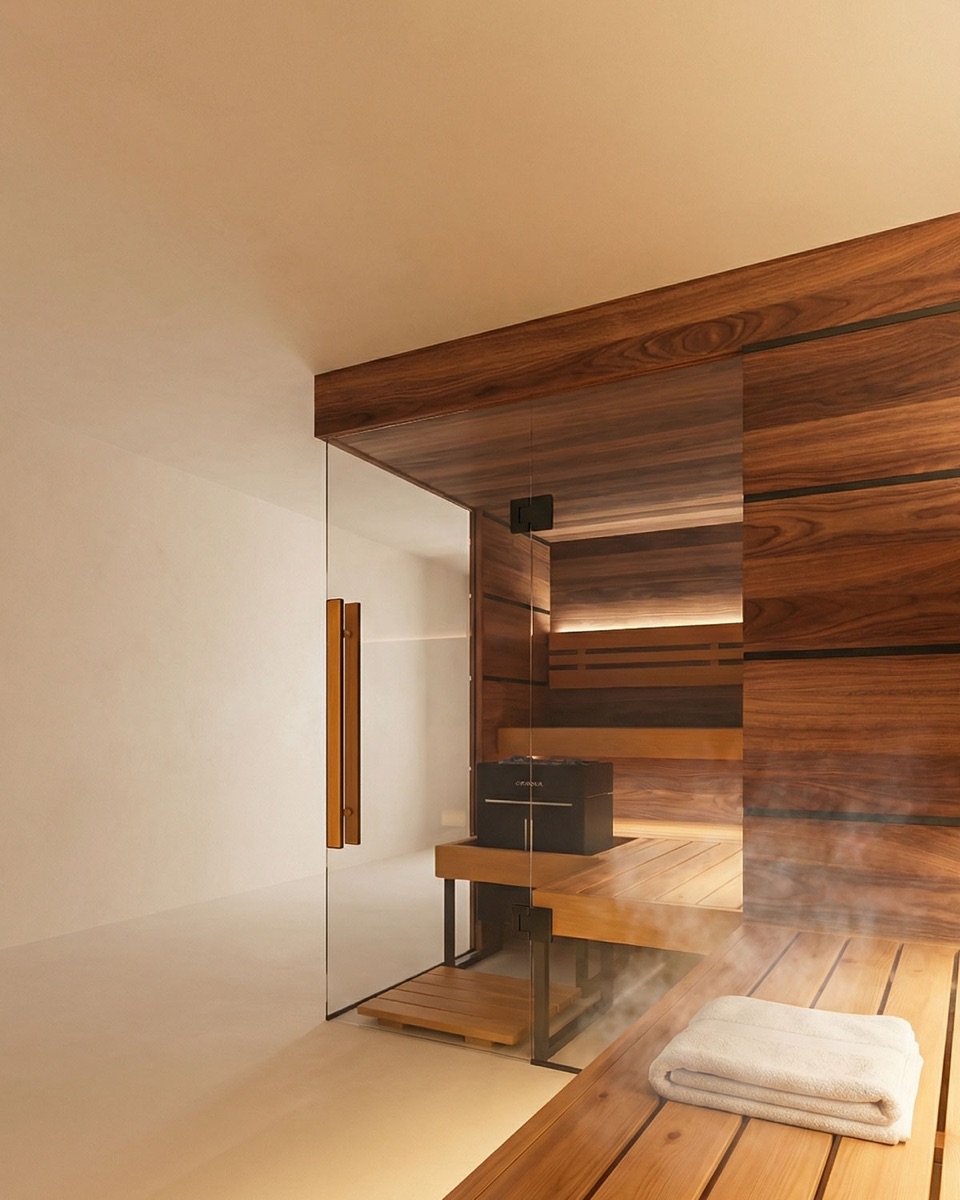
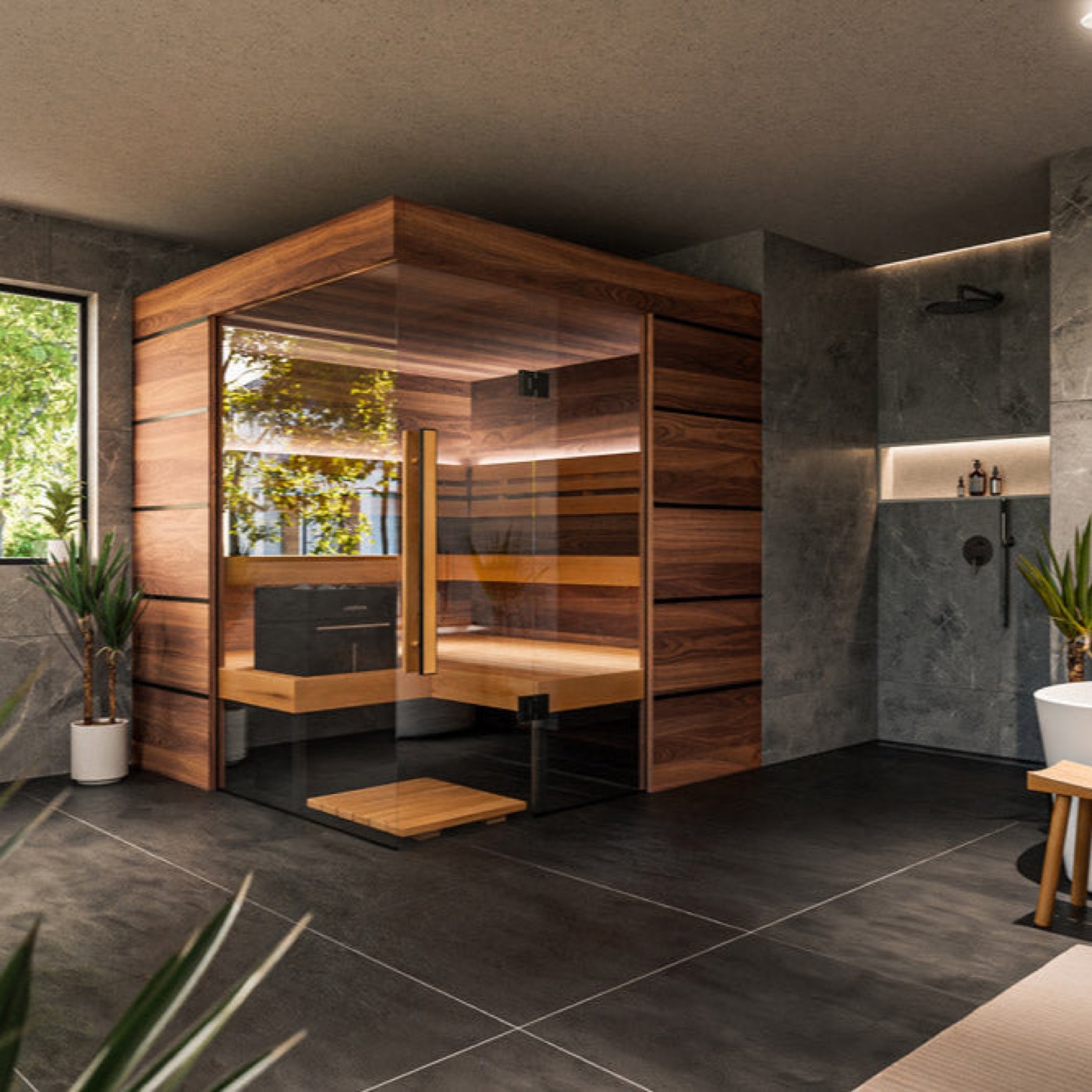
Thermasol photography is warm, natural, and textural — a sanctuary captured in soft light, never a clinical product shot.
The photographic point of view
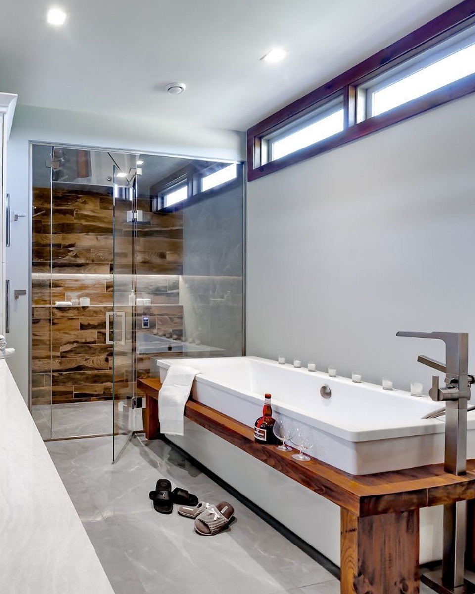
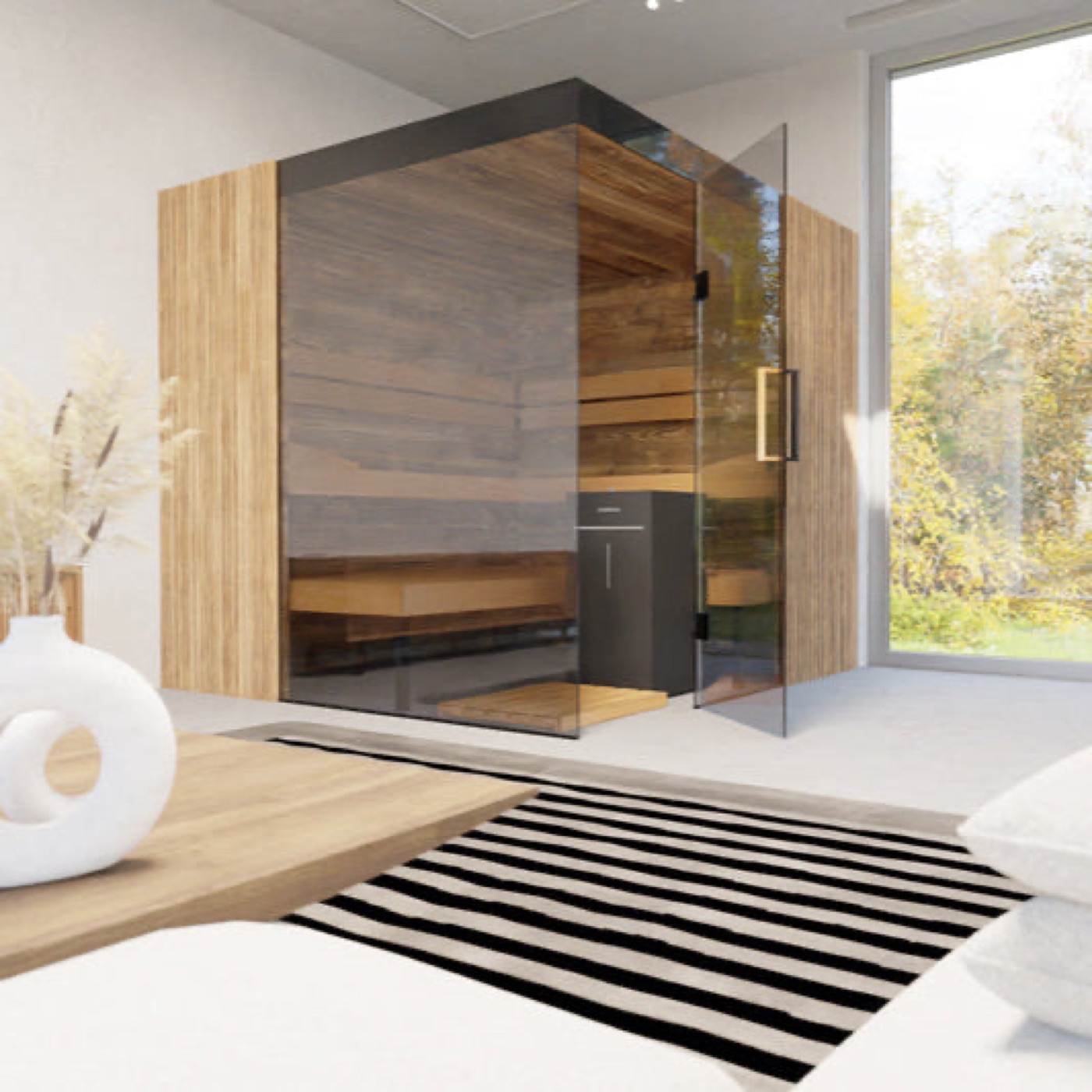
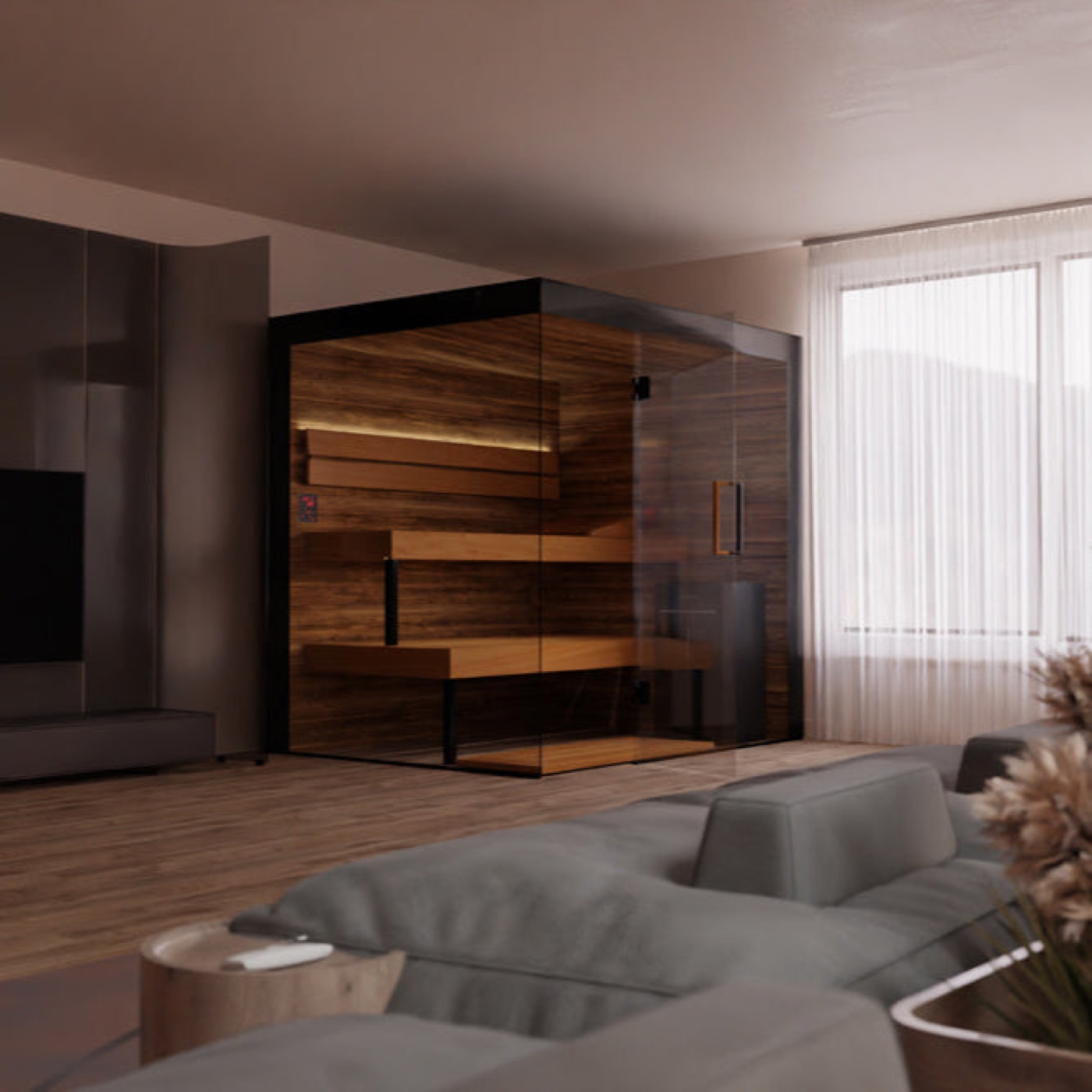
Every image should feel like it belongs in the feed of Aesop, Aman, or Four Seasons. The mood is premium, warm, and inviting — intimate spa atmosphere built from real light and real materials. It is never clinical, sterile, or stock. The product lives inside an experience, and the experience is what the camera is after.
Lighting & color grading
Light carries the whole point of view. Shoot and grade for warmth, softness, and the feeling of golden hour.
- Color temperature: 4000–5000K (warm).
- Color grading: +10–15 warmth in post.
- Lighting: golden hour, soft diffused natural light, warm ambient glow.
- Reduce highlights slightly for a softer look; lift shadows for a rich, not dark, mood.
- Remove any clinical blue tones before export.
Materials & texture
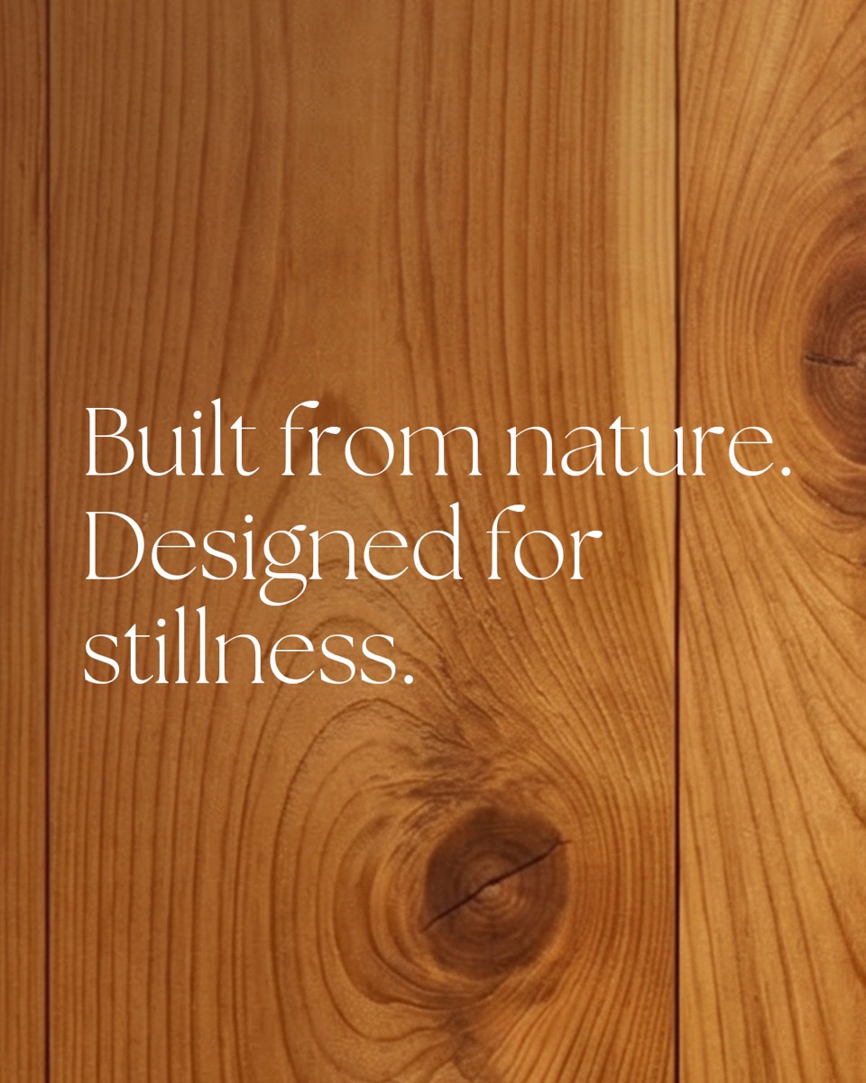
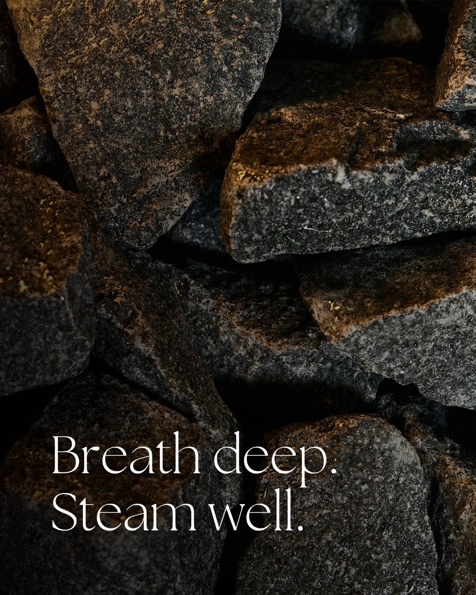
Texture is the subject. Build images around natural materials and let the camera find their grain and surface: wood, stone, glass, and linen. Steam should read soft and natural, never heavy or filtered.

Human presence
People may appear, but faces are always obscured. Crop them out, place them in shadow or silhouette, or shoot from behind. An identifiable face breaks the mood and the rule. The presence should suggest the ritual, not document a person.
Composition
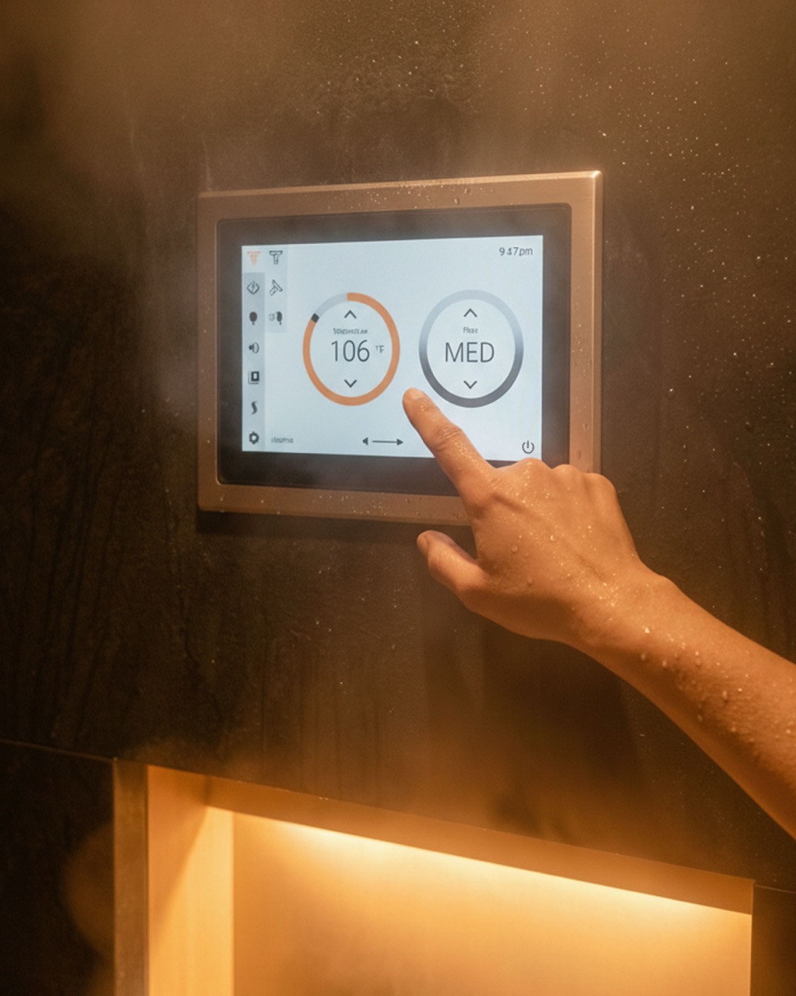
Compose for calm. Reserve 40% or more as quiet space — room to breathe and room for text to live later. Show the product in a beautiful interior context surrounded by natural materials; never isolate it on white or stage it like a showroom floor. The feeling is the hero, not the spec sheet.
Do / Don't — Photography
| Do | Don't |
|---|---|
| Soft diffused natural light | Harsh artificial lighting or flash |
| Warm balanced exposure | Overexposed or flat lighting |
| Warm indirect mood lighting | Cool, clinical blue-white light |
| Keep steam soft and natural | Heavy filters or unnatural grading |
| Obscure faces (cropped, shadow, behind) | Identifiable faces |
| Focus on texture (wood, stone, glass) | Stock-photo aesthetic |
Do / Don't — Product Presentation
| Do | Don't |
|---|---|
| Product in a beautiful interior context | Product isolated on white or plain |
| Natural materials surrounding it | Cluttered or busy environments |
| Neutral, calming palette | Showroom-floor aesthetic |
| Minimalist, curated styling | Specs or features called out |
| Focus on experience and feeling | Product as the hero |
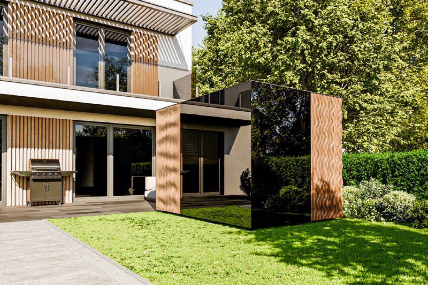
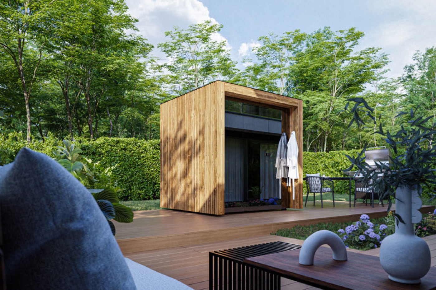
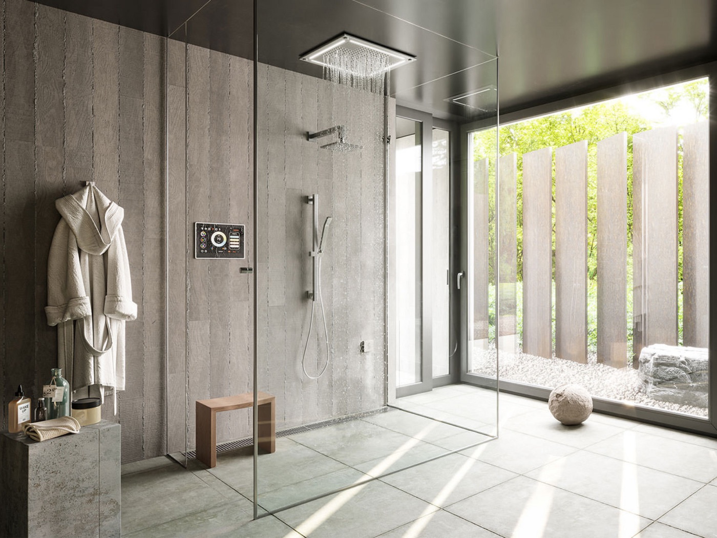
Product, shown in context — the Thermasol controls and fixtures placed within a warm, finished space rather than isolated on white:
Do / Don't — Color Palette
| Do | Don't |
|---|---|
| Obsidian for dark tones | Pure black #000000 |
| Solace cream for bright areas | Pure white #FFFFFF |
| Stillness sage as a soft cool | Cool blue tones |
| Umber Haven and Driftwood earth tones | Bright saturated colors |
| Natural material colors | Neon or fluorescent tones |
| Restrained grading toward warmth | Heavy color grading |
The warm palette is the default for B2C work. The cool palette is reserved for B2B only.
The five questions to ask before posting
- Lighting: is it warm and natural, not clinical?
- Faces: are any visible humans unidentifiable?
- Context: is the product shown in a beautiful environment?
- Text: is the copy minimal (6–8 words) and mood-enhancing?
- Color: is the palette warm, using brand colors only?
All five must be yes before an image goes out.
The Aesop test: pull up @aesop on Instagram and ask whether your image would fit seamlessly in their feed. If yes, proceed. If no, revise until it does.