Case Study
Solace: a design system for Thermasol
Solace turns Thermasol from a product-led catalog into an experience-led brand, encoded as a standards-based, multi-dimensional design system that any team can theme, build, and ship.
Context
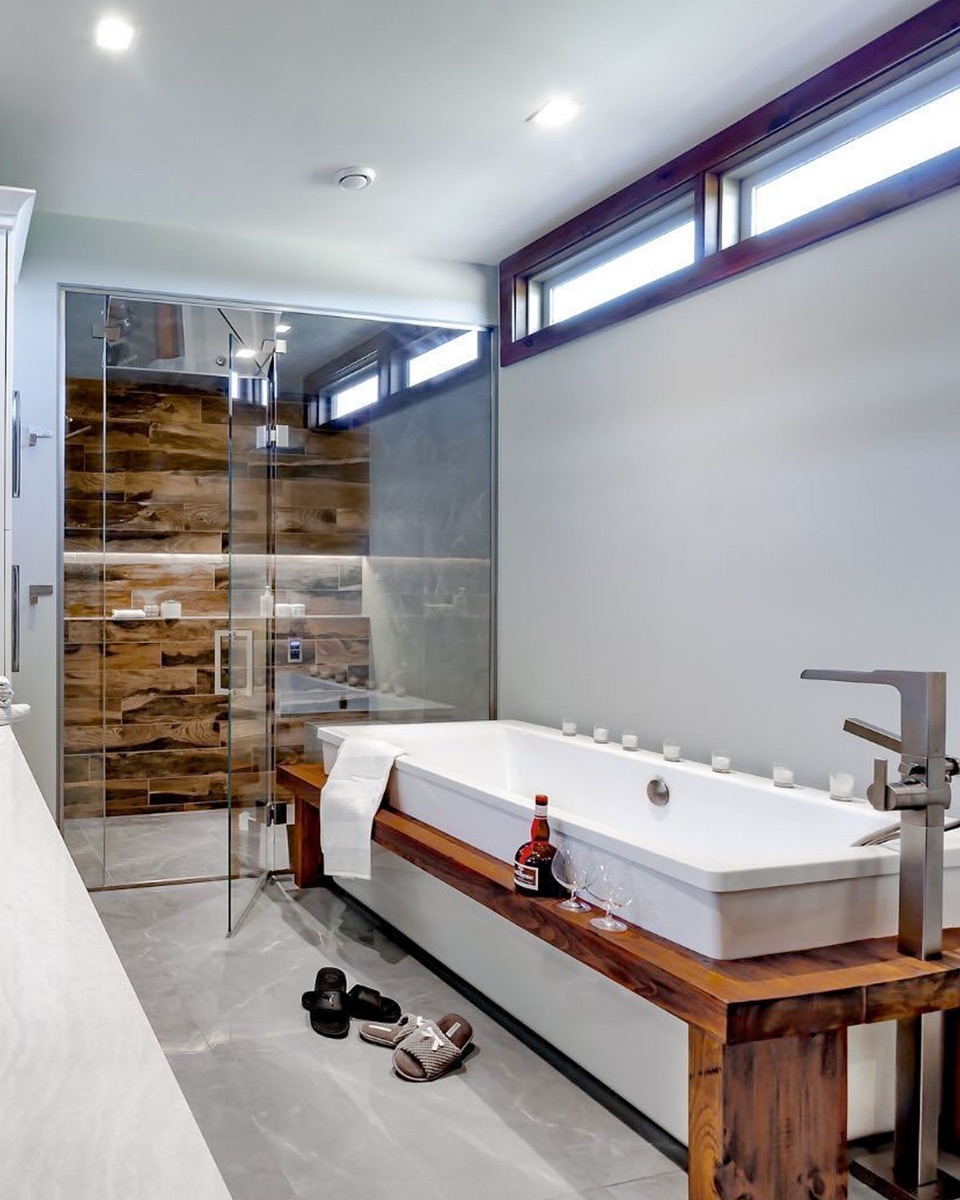
Thermasol is The Original Wellness Company, founded in 1958 and now part of Harvia. It makes steam showers, saunas, and smart showers — the hardware behind home wellness rituals. The category is intimate and sensory: warm stone, soft light, the quiet hum of a space built for stillness.
The brief was deliberately broad. Not a logo refresh, not a single campaign, but the connective tissue underneath everything Thermasol ships — web, social, email, print, and product UI — built so it holds together as the brand scales across a B2C audience of homeowners and a B2B audience of designers, builders, and hospitality partners.
The benchmark was set early as a single question, borrowed from the brand's own reference library:
Would Aesop, Aman, or Four Seasons post this? If the answer is no, it does not belong.
The problem
A current-state audit of Thermasol's brand application surfaced a consistent gap between how the brand wants to feel and how it actually shows up.
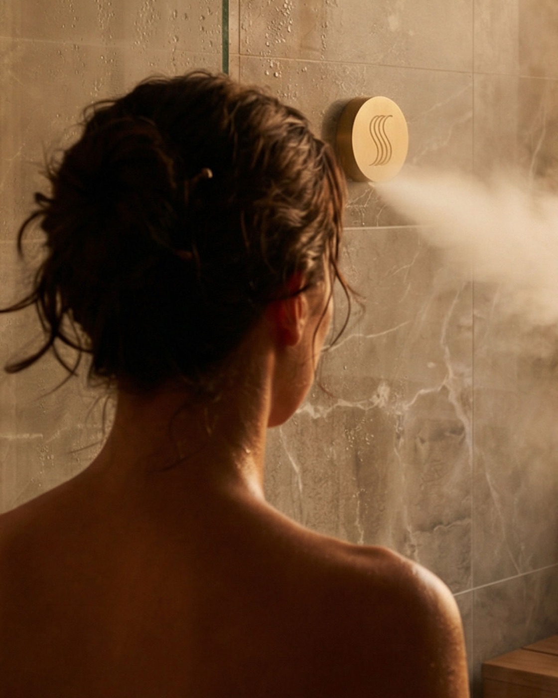
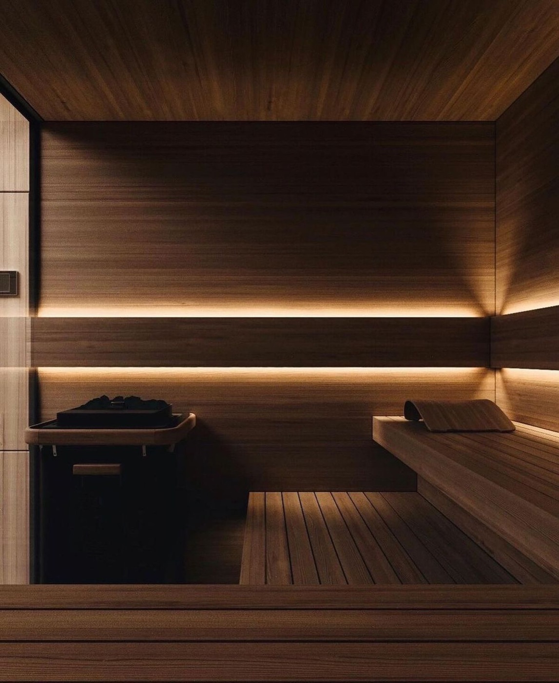
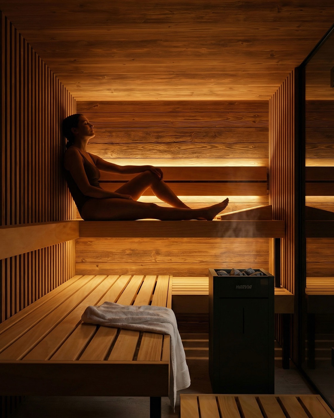
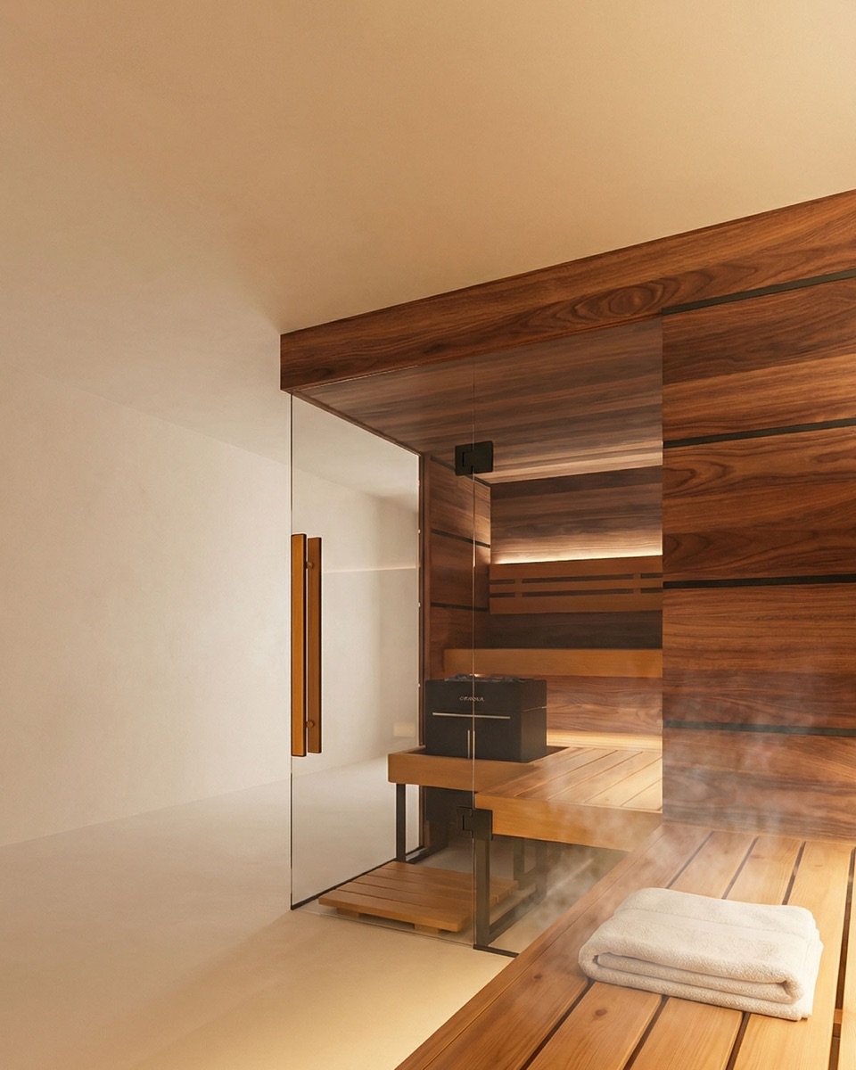
- Clinical lighting. Photography leaned on cool, blue-white, showroom light — the opposite of the warm, golden, moody atmosphere the category demands.
- Product as hero. Imagery isolated products on plain backgrounds with specs and features called out, instead of placing them in beautiful, lived-in interiors where the feeling is the point.
- Inconsistent tone. Voice swung between promotional announcements and aspirational mood, with no shared rule for when to be which.
- Fragmented application. The brand was assembled differently on every channel — typography, spacing, and color drifted with each new asset.
- Conflicting color values. This was the most telling finding. Legacy guides disagreed with each other on the brand's own colors. The same named swatch carried different hex values across documents — "Solace" cream appeared as both
#F5F0E8and#CBC0AC; "Obsidian" as both#2D3834and#2D2925. There was no single source of truth, so there was no way to be consistent even when people tried.
| Symptom | Audit finding |
|---|---|
| Lighting | Cool, clinical, blue-white instead of warm and natural |
| Composition | Product isolated as hero; specs over sensation |
| Color | Same swatch names, different hex values across guides |
| Typography | Off-brand fonts and centered, magazine-style layouts |
| Application | Brand rebuilt ad hoc per channel, no shared primitives |
The throughline: the brand had taste but no system. Every good decision had to be re-made by hand, and many were re-made wrong.
The strategy
The move was from product-led to experience-led. Thermasol does not sell steam generators; it sells the ritual the steam makes possible. Everything in Solace is organized around that shift.
Three principles set the creative direction, calibrated against the Aesop / Aman / Four Seasons benchmark:
Warmth over clinical. Restraint over noise. Anonymity over performance.
- Warmth governs color and light. The palette is warm-neutral; photography is golden and diffuse; cool tones are reserved strictly for B2B contexts.
- Restraint governs density. Generous quiet space, minimal copy, two typefaces only — The Seasons for emotional and editorial moments, Poppins for everything functional.
- Anonymity governs people and product. Faces are obscured or cropped, product sits inside a beautiful interior rather than on a pedestal. The space, not the SKU, is the subject.
These are not mood-board adjectives. Each one resolves into a concrete rule that the system can enforce.
The system
Solace is a real, deployed design system — not a slide deck. It is structured so that creative intent is encoded as code and cannot quietly drift.
Design tokens, standards-based. Every brand decision lives as a W3C DTCG token in JSON, organized in three tiers: primitives (raw color ramps, type, space, motion), semantic aliases (color.bg.canvas, color.text.primary, color.accent), and component tokens that reference semantics only. The tokens compile through Style Dictionary into CSS variables, a Tailwind preset, and TypeScript types — one source, many outputs.
Multi-dimensional theming that encodes a real brand rule. Themes are resolved across two independent axes: brand (warm for B2C, cool for B2B) and scheme (light, dark). That is not decoration — it is the literal codification of Thermasol's existing rule that warm equals consumer and cool equals B2B. Switching the brand axis re-themes an entire interface without touching a single component.
One sand ramp to end the palette war. The conflicting legacy values were reconciled into a single warm-neutral "sand" ramp expanded to a full 50–900 scale. Where guides once disagreed on what the brand's cream actually was, there is now one ramp, one set of names, and one answer.
A token-driven component library. React and TypeScript components built on Radix UI primitives for accessibility, styled entirely from tokens via CSS. Components consume semantic tokens only, never raw values — which is what makes free theming possible.
A documentation site as the hero artifact. A Next.js (App Router) and MDX site inside a pnpm and Turborepo monorepo, with packages for tokens, UI, icons, and assets feeding the docs app. The system is authored, versioned, and published as a product — not bolted onto a single app.
| Layer | Choice |
|---|---|
| Monorepo | pnpm workspaces + Turborepo |
| Tokens | DTCG JSON → Style Dictionary → CSS vars, Tailwind preset, TS types |
| Theming | brand (warm/cool) × scheme (light/dark) |
| Components | React + TypeScript, Radix primitives, token-driven CSS |
| Docs | Next.js App Router + MDX |
Decisions and trade-offs
A few decisions did the heavy lifting, and each carried a cost worth naming.
- Reconcile the palette to one ramp. Collapsing the conflicting legacy values into a single sand ramp meant overriding values that appeared in older guides. The trade-off — breaking literal fidelity to documents that already disagreed with each other — was the entire point. Consistency was impossible until something authoritative replaced them.
- A custom px-to-rem token transform. Brand specs were authored in pixels, but accessible, scalable UI needs rem. Rather than hand-convert and invite drift, the build pipeline runs a custom Style Dictionary transform that converts spacing and type tokens to rem at compile time. The source stays human-readable in px; the output stays correct.
- Semantic-token-only components. Components are forbidden from referencing primitives directly. This adds an indirection layer and a naming discipline up front, but it is what makes the brand and scheme axes work for free — a Button never knows whether it is rendering warm or cool, light or dark.
Outcome
Solace delivers a coherent, themeable, documented system where there was once a folder of conflicting guides.
- The brand's experience-led direction is now load-bearing infrastructure: warmth, restraint, and anonymity are enforced by tokens, not by reminders.
- A single token source produces consistent output across CSS, Tailwind, and TypeScript, so web, marketing, and product UI stay in sync by construction.
- The warm/cool and light/dark theming makes the B2C and B2B split a switch rather than a separate build, eliminating the per-channel drift the audit found.
- The palette war is over: one ramp, one source of truth.
- New work starts from a documented, accessible foundation, so good decisions are made once and reused — not re-made by hand each time.
Credits
Solace is a self-directed concept by Diego Saenz, built on the real Thermasol brand as a portfolio exploration of creative direction and design-systems engineering. It is not an official Thermasol or Harvia product, and it is not affiliated with or endorsed by either company.